Design information
Design name
AABGOON
Primary function
Logo and Visual Identity
Location of the project
Iran
Year of design
2021
Category
Graphic Design and Visual Communication
Design team
Fariba Bahrami
Credits
-
Description
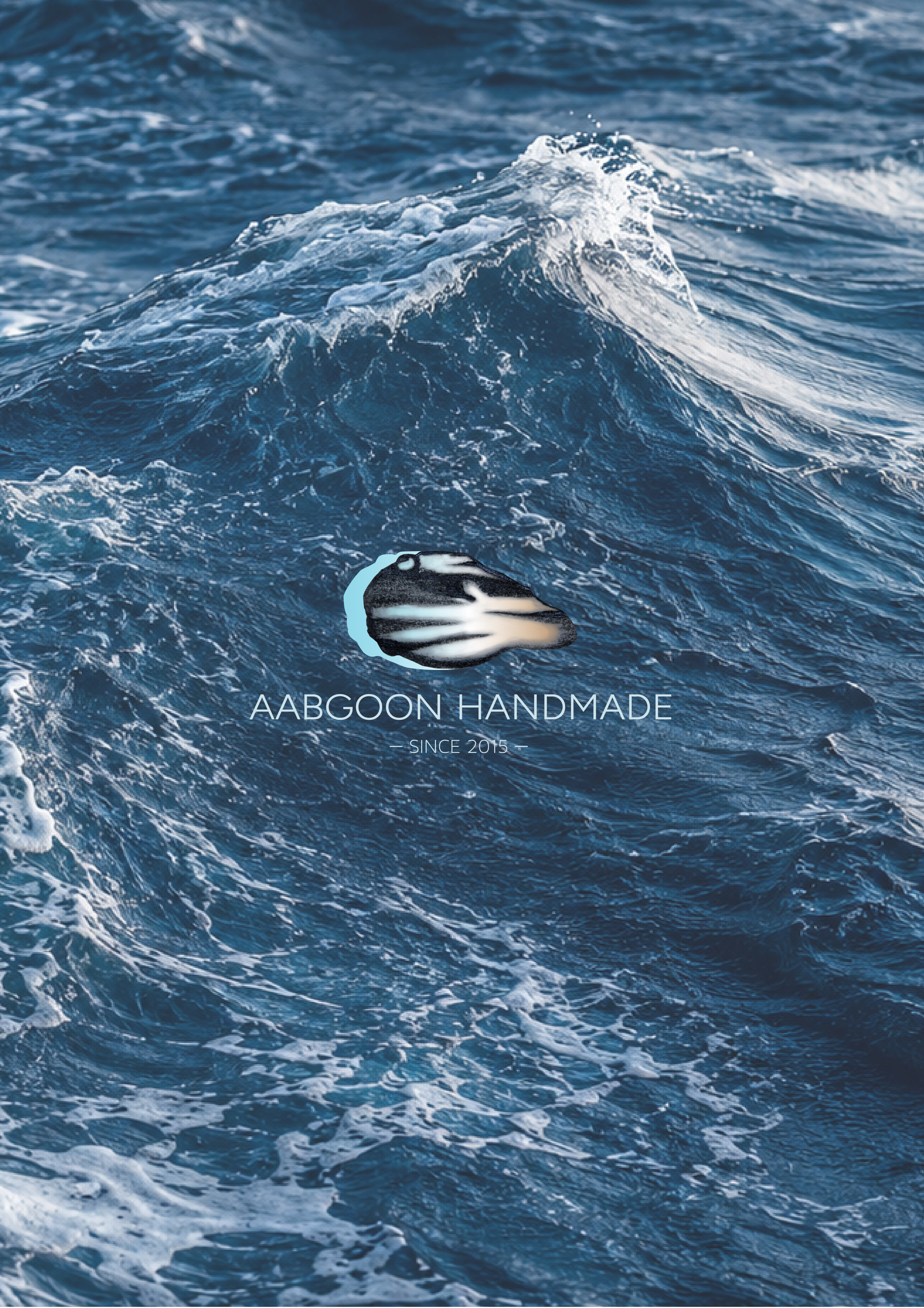
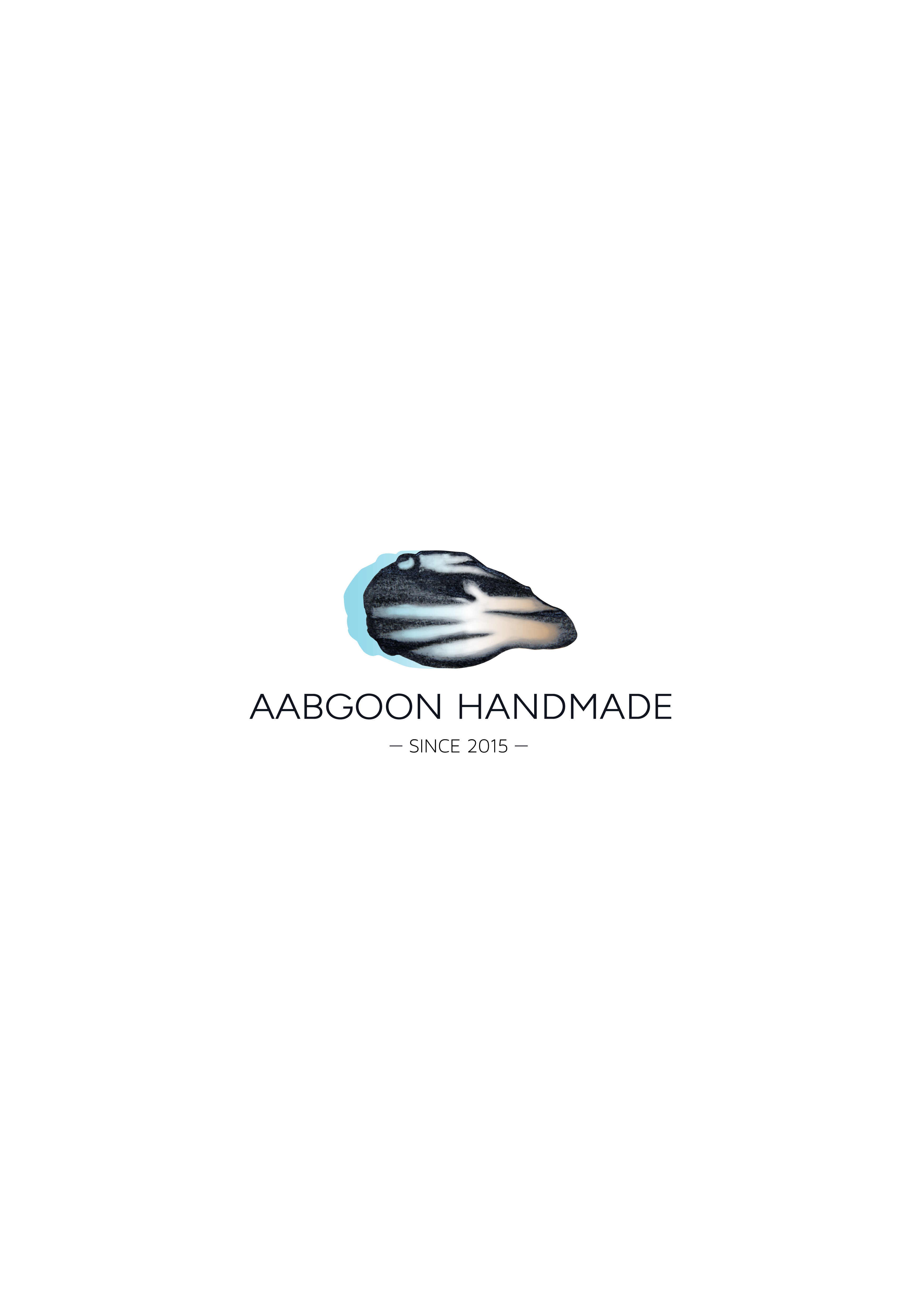
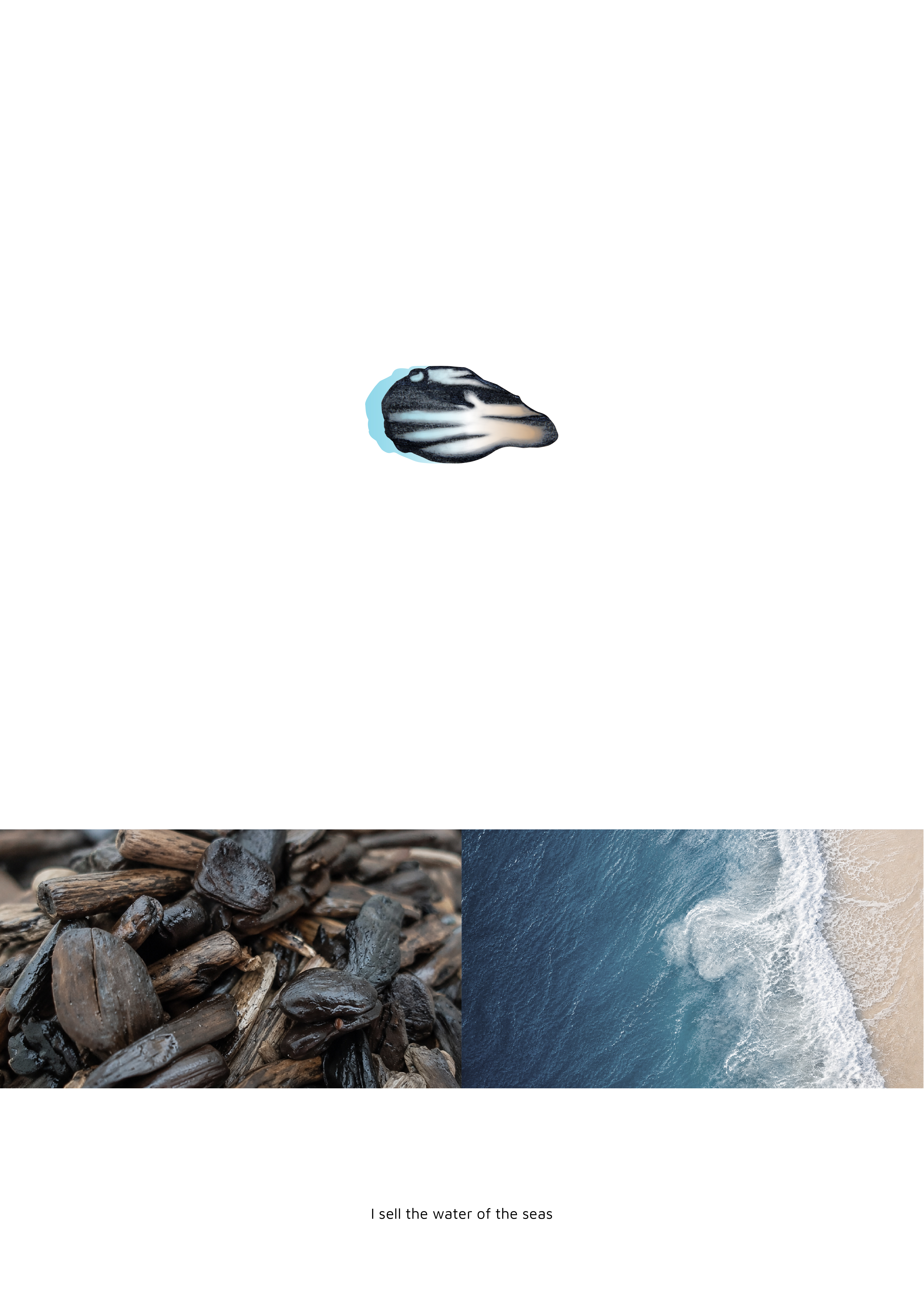
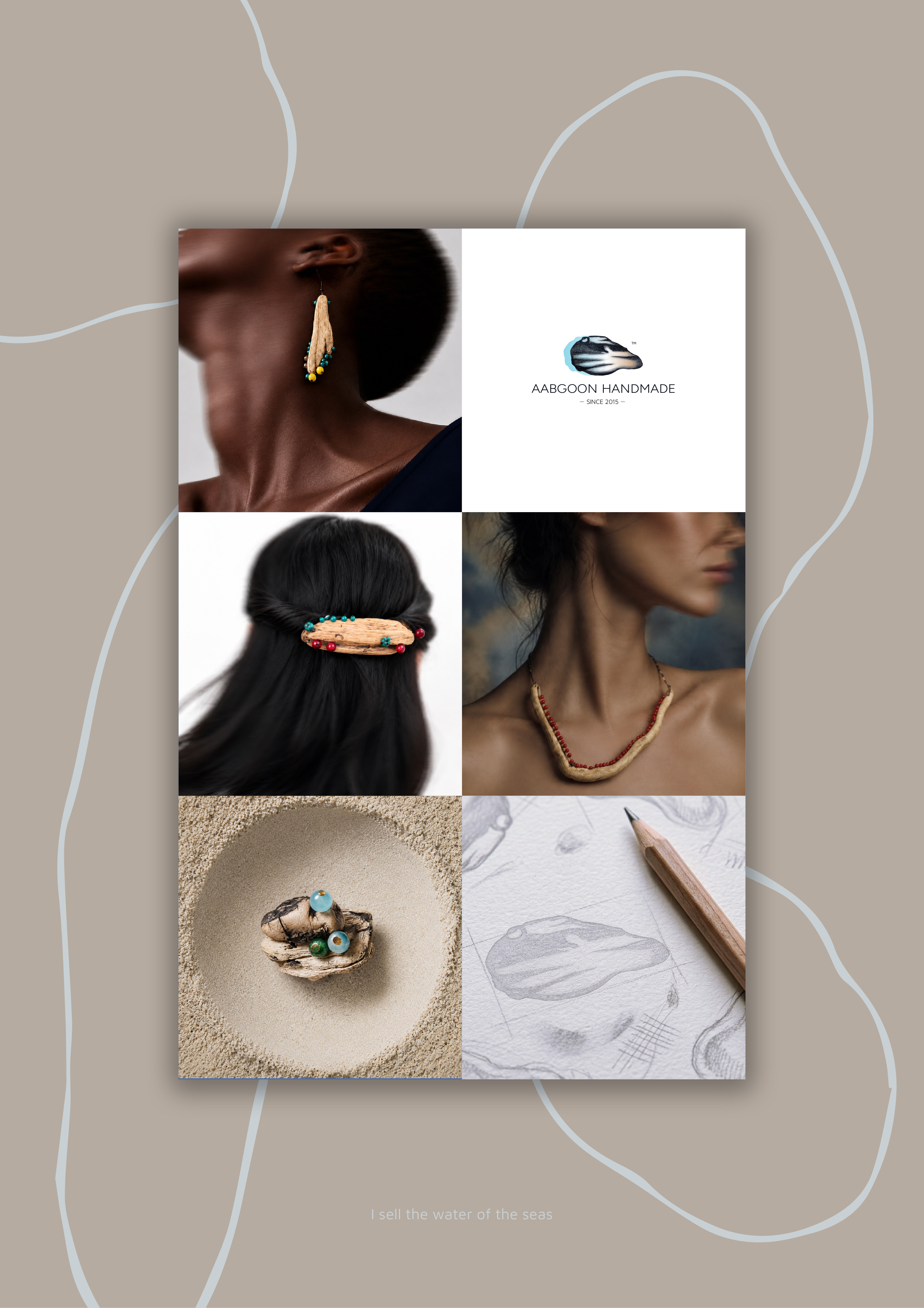
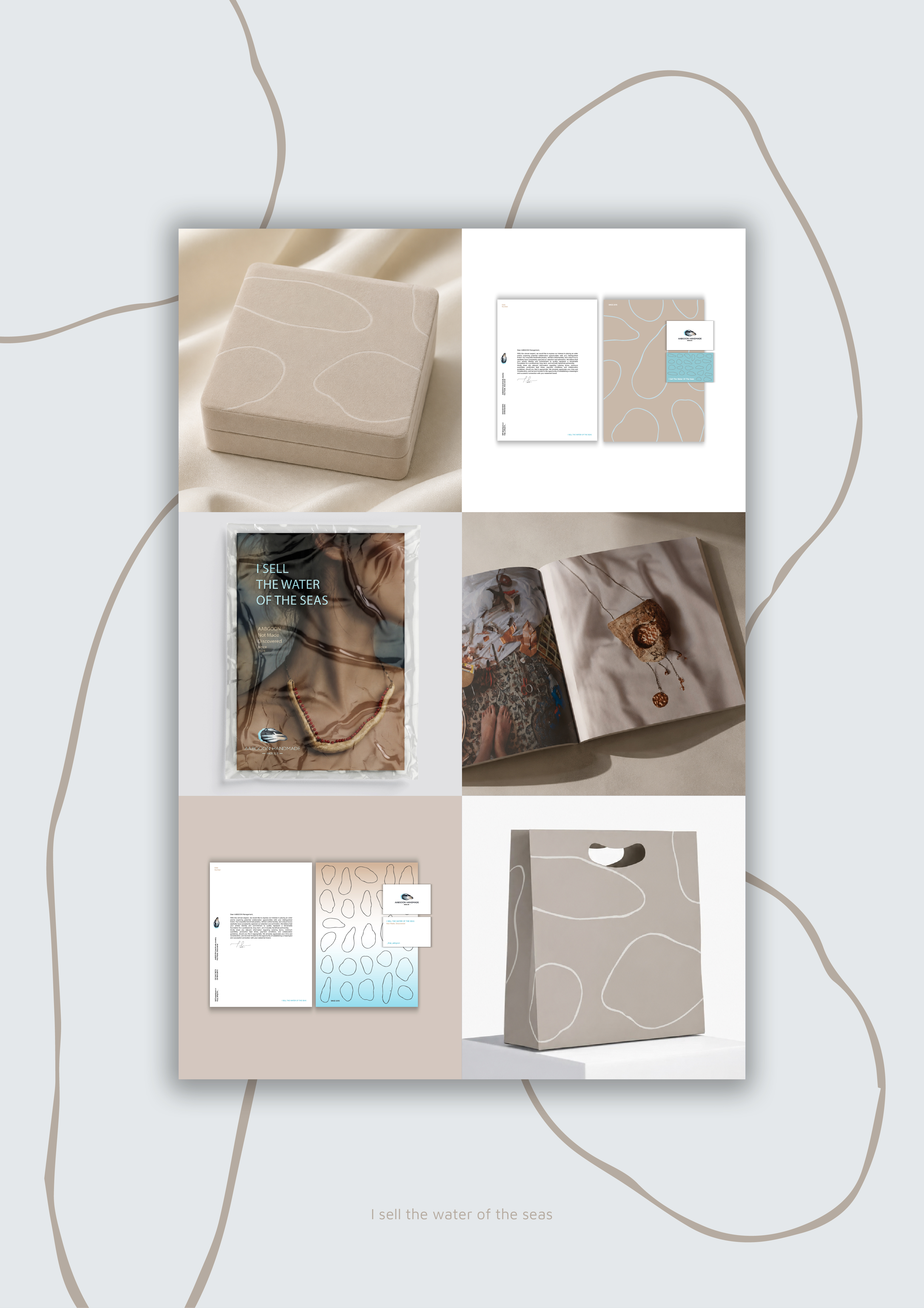
For me, the AABGOON logo was not merely a design; beyond geometry and playing with lines, it was a discovery. Like finding a small piece of driftwood on the shore and tracing the days held in its lines, the logo was born not from the usual design process, but from those sea-borne woods: a raw, forward-moving, wave-like form marked by its journey. Keeping this authenticity within a designed structure was a conscious choice to preserve natures essence; AABGOON belongs to nature, and its beauty lies in fidelity to this unpretentious world. The gradient reflects the seas dynamism: calm blue, wave-white, and the warm cream of sand, symbolizing union with nature. The blue form breaking beyond the frame suggests endlessness and forward motion. AABGOON is a story of giving value; finding beauty in what was forgotten. It chronicles the seas forgotten pieces, bringing them to life once more. As Lorca says: 'I sell the water of the seas, sir.'
Website
-
Client
Marjan Oman